

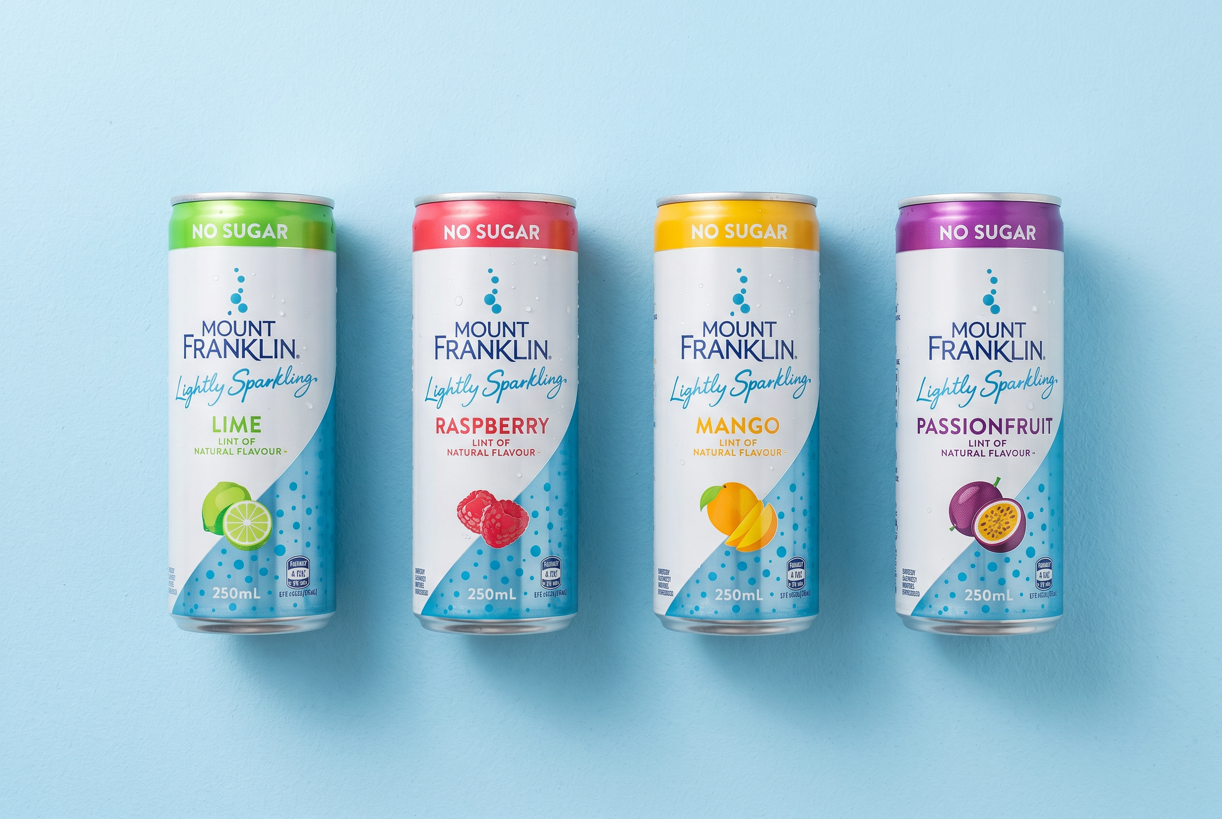
The launch of the Mount Franklin Lightly Sparkling range required a fresh, premium identity that captured the product's light, refreshing character while complementing the trusted Mount Franklin brand.
The goal was to create a distinctive Lightly Sparkling wordmark which was later developed into a bespoke typeface for use across the range.
The identity was rolled out across cans and outer cartons, ensuring a cohesive and consistent packaging system across multiple formats. Custom illustrations were also developed for the packaging, bringing each flavour to life and reinforcing the range's vibrant, contemporary personality.
Mount Franklin Lightly Sparkling

Client
Coca Cola Amatil
Disciplines
Word mark / Typography (Lightly Sparkling)
Design implementation and rollout
Illustration
Agency
Creative Platform
Kelly Dos Santos